Reactive SVG charts with Ractive.js
Applying MVC pattern to Data Visualization
author: Marcello La Rocca - Data Visualization Engineer @ SwiftIQ
Index
- Data Visualization in Summary
- An Overview of Visualization Libraries
- Declarative Frameworks
- MVC Visualization Libraries
- A Comparative Example
- Description
- Implementation with D3
- Implementation with Ractive
- PathsJs
- Conclusions
Data Visualization in Summary
Demand for data visualization is costantly growing, such that companies can't afford ignoring it anymore to stay in the market.
While in-house solutions can be tempting, there are good off-the-shelf solutions available as well.
As the amount of data produced and made available on the web by social interactions and ecommerce grows larger and larger, structuring and visualizing these data in meaningful (and human-friendly) ways becomes increasingly crucial.
The amount of data generated grows exponentially every year, such that in late 2013 it was estimated that 90% of world's data had been generated over the previous two years; companies faces an arm-race to make sense of this flood of information, which can easily make the difference between understanding the market or going out of business.
While most companies easily cope with collecting data (from clicks, visits, purchases, applications' logs etc...), not all of them are able to transform the information into knowledge (or at least valuable indications). The result is that gathering terabytes of information is pointless if then we don't have efficient way to summarize and visualize it - in a few word, extracting meaning from the mere information.
In the last few years both IT giants like Google (with Google Analytics) and startups have turned their attention to this increasing demand for data-visualization tools. A new market segment has indeed thrived around this idea, with mainly two kind of products:
- Off-the-shelf solutions, tools that users can either use
- to see a commprehensive but static set of views about the data they gathered/generated (Google Analytics itself could be an example)
- or to create customizable (up to a certain point) charts to visualize their data (HighChart is a good example).
- Customized solutions, ad-hoc tailored for specific clients - usually these solutions change over time, and they also include continuous support for clients. SwiftIQ is a good example of such a company.
The alternative to such products would be, of course, in-house developments of such tools - but that's often too costly for start-ups or small companies.
Either if you need to develop charts on your own or if you are a company that offers in data-visualization as a service, you'll need to build your work upon a chart library - and hopefully a good one too.
An Overview of Visualization Libraries
There are a few good, open source chart libraries out there that helps developers integrating charts and visualization solutions in web applications.
Most of them are based on imperative programming, almost all of them uses SVG over HTML5: let's see which and why
Among the vast offer of libraries for data visualization, the first big distinction can be made between HTML5 libraries and SVG libraries.
- HTML5 solutions uses the Canvas object, introduced in HTML5, to draw the shapes (or images) in the chart.
- SVG solutions uses the Scalable Vector Graphic format, a markup language derived from XML that is supported by all browsers. Current version is 1.1 (technically 1.2, but no new features were introduced), but version 2 of SVG specifications is about to be released.
SVG and HTML5 solutions, as you would expect, have some Pros and Cons; oversimplifying we could say that:
- SVG is a vector-based format, which means each drawn shape is an actual object added to the DOM. This means that the same shape or complex drawing can be ported to different devices and screen sizes without any noticeable loss of quality; also, being each shape an object of its own, if an attribute of an SVG object is changed, the browser can automatically update the view by re-rendering the corresponding node.
- Canvas is raster-based, so resizing the image created will produce pixelation or loss of details, and to reposition or change color to a shape, the whole scene needs to be redrawn. (However, layers can be created, such that only the layer containing a particular object needs to be redrawn)
- While it is possible to add an event listener to SVG elements, for Canvas shapes it is not: the behaviour of mouse clicks, for example, must be associated with single pixels on the canvas rather than shapes.
- On the other hand, when lots of elements are drawn to a SVG chart, every one of them is added to the DOM, even if it is not visible. In charts with tens of thousands elements shown, SVG solutions don't scale well.
- Also, Canvas are great to draw raster images and creates sprites, while in SVG it is simply not possible.
All things considered, since rarely you do need to insert more than a few hundreds shapes in a single chart (and if you do you might want to revisit your design), so far SVG has been the mainstream technology for data visualization.
HTML5 solutions
Probably the most famous example of a chart library using this solution is ChartJs.
Another interesting library to manipulate shapes in the Canvas is FabricJs.
SVG solutions
- D3.js is a data-driven, SVG-oriented visualization library created in 2011 at Standford, and brought on as an open source project.
As of today, it is probably the most widely adopted and the one with the highest number of plugins and extension.
In D3 the data-binding and the presentation are embedded in the logic (JavaScript) part.
+ You can find extensions or examples for almost any kind of chart you might want to create
+ Data binding native support
+ Well documented
- Data binding in JavaScript might not be very intuitive for complicated graphs
- Performance is sometimes an issue, and some popular extensions are prone to memory leaks - Raphael provides a set of primitives for vector-based graphics in the browser supporting SVG and VML, created by Dmitry Baranovskiy as a personal project.
gRaphael is a charting library built upon Raphael.
+ A rich set of low level primitives for drawing SVG
+ Very good performance and appearance
+ Great for animations
- Doesn't support data binding by itself
- Not many examples and charts available on the Net - Snap.svg is the evolution of Raphael: it's designed for modern browsers, by giving up compatibility with obsolete browsers it supports the newest SVG features like masking, clipping, patterns, full gradients, groups, etc...
+ Great for SVG drawing
+ Amazing look thanks to the newset features
+ Can work with and animate existing SVG (like jQuery with existing HTML)
- It's a low level library, no support even for charts yet, let alone data-binding
- The project has not reached full maturity yet - Template based solutions... (more in next section)
Declarative Frameworks
As we saw, D3.js supports data-binding, so that your charts can be configured such that they will update as the data to be shown change.
Updates, however, must be manually triggered by developers every time they feel their data might have changed, and the update mechanism
must be set in stone explicitly in the code by providing callbacks to be invoked for datapoints entering and exiting the dataset associated with the graph.
Declarative frameworks also provide primitives for data-binding and not just for SVG: any DOM element can be associated with data and kept in sync with it.
The difference is that the binding happens using templates in the presentation (the HTML markup) and that the presentation is updated automatically every time the data behind it changes.
The added value of these frameworks can be identified in a few key points:
- They enforce a greater degree of separation between content and presentation, by letting you bind in the presentation layer data, event handlers and even structure of the view (like for iterative and composite objects, for example tables).
- They provide an easy way to keep your data model and your presentation in sync
- They generally do it in an extremely efficient way, making sure to reflow only the minimum possible subset of your DOM tree (and keep in mind that reflowing and repainting are usually bottlenecks for client-side browser applications)
The synchronization between data and DOM is obtained with different strategies, but mainly two kinds of techniques are employed:
- Dirty Checking (Angular) - Behind the scenes, the framework runs a digest cycle, and during each iteration, a deep comparison on all the Models that are presently displayed within the view is performed. If a difference is detected, and the data changed is bound to any element, all the element relaying on those data are either notified or directly updated (depending on the implementation).
- Container objects (Ractive, React, Ember) the framework creates objects which wraps around the data; these objects have accessors to the data and so every time you set or get any property the framework can capture your action and internally broadcast it to all the subscribers.
While dirty checking will likely become computationally intensive as the number of watched objects grow, container objects make integration with external code more difficult. Moreover, the introduction of Object.observe() in ES7 (already supported in Chrome 36) will cut the overhead for dirty checking.
MVC Visualization Libraries
As we saw, D3js introduces the concept of data-binding for SVG-based chart libraries.
This binding, however, has to take place in the logic layer: since you also have to specify the structure and composition of your chart in JS, you are actually moving part of your presentation inside the logic.
As we strive for greater separation, we look to Declarative Frameworks data-binding features to enforce the MVC pattern.
If only there were SVG libraries to use on top of these frameworks...
... Turns out, there are ...
- PathsJs is a minimal library by Andrea Ferretti that is, explicitly and by design, oriented to support reactive programming by generating SVG paths that can be used with template engines. It offers three API levels, of increasing abstraction. The lowest level is a chainable API to generate an arbitrary SVG path. On top of this, paths for simple geometric shapes such as polygons or circle sectors are defined. At the highest level, there is an API to generate some simple graphs (pie, line chart, radar...) for a collection of data, assembling the simple shapes.
- n3-charts is a visualization library specifically designed to be used in conjunction with Angular. At the moment, they only offer line-charts, bar-charts and pie-charts. The API is only high-level but the quality of the graphics is very good.
... but you don't even need them!
So, you can use can draw complete charts using n3-charts or PathsJs' highest level API.
Or you can use the low lovel APIs of PathsJs to generate SVG paths or shapes from your data, and bind those objects to your view
But in the end, you can do just fine without either: using Ractive or React alone, for example, you can easily and smartly iterate over a collection of objects in-line in the HTML, and associate SVG elements (bars, lines, circles etc...) with each data-point. Add some CSS-styling, and your MVC-compliant chart is ready.
A Comparative Example
To better illustrate the differences between the two approaches, an example is probably more effective.
The ideal situation where a template based approach result more powerful is with composite documents with a recursive structure, even more if the same sub-layout is repeated over several elements.
In particular let's suppose:
- We have to group some data in a time series by, for example, day of the week, or - perhaps simpler - by part of the day: morning, afternoon, evening, night.
- However, we want this segmantation to be dynamic: even the name of the segments, their number and the time they start/end are passed in the data.
- For each segment, a bar chart will be created, showing some metrics about that segment.
- At the same time, for each segment a table with a selection of the entries in that segment will be shown.
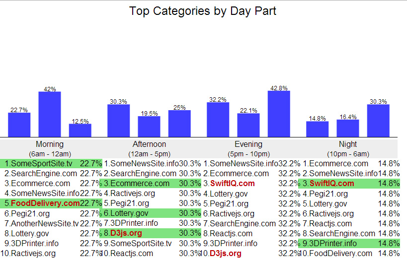
A concrete example
- Our time series comes from analytics about a group of web pages
- We group data by part of the day, and since this grouping is dynamic, structured data will include infos on these segments.
- We measure visits, unique visitors and say click on banners
- For each segment, a bar chart will show the values for the three metrics above.
- For each segment a table will be shown with the top 10 pages visited for that segment.
This is an example of a JSON file containing data for this chart
                  [
                      {
                          "name": "Morning",
                          "start_time": "6am",
                          "end_time": "12am",
                          "visitors": 22.7,
                          "unique_visitors": 42.0,
                          "clicks": 12.5,
                          "top_pages": [
                                          {"page": "SomeSportSite.tv", "visitors": 23},
                                          {"page": "SearchEngine.com", "visitors": 20},
                                          ...
                                        ]
                      },
                      {
                          "name": "Afternoon",
                          "start_time": "12am",
                          "end_time": "5pm",
                          "visitors": 30.3,
                          "unique_visitors": 19.5,
                          "clicks": 25.0,
                          "top_pages": [...]
                      }
                      ...
                  ]
This, instead, is a sketch of how the chart should look like
D3 implementation
Let's first see how this could be implemented using D3
HTML
This is all the HTML needed for a chart:
<div id="day-chart" class="day-chart-div"></div>
Of course, part of the structure that we will add via JavaScript can be moved here, but it's just a little part. There are many ways to do this according to taste and needs, but html is usually going to be as straightforward
Javascript: create a chart for a single segment
          var segmentChart = segments
                          .append('div')
                          .attr('class', 'day-part-chart')
                            .append('svg:svg')
                            .attr('width', svgWidth)
                            .attr('height', svgHeight);

              fields.forEach(function (fieldName, fieldIndex) {
                  segmentChart
                    .append('text')
                    .attr('x', rectMargin + fieldIndex * (rectMargin + rectWidth) + rectWidth * 0.5)
                    .attr('y', function (d) {
                      return rectTopMargin - 1 + rectHeight * (1 - scalePercent(d[fieldName]));
                    })
                    .attr('text-anchor', 'middle')
                    .text(function (d) {
                      return d[fieldName];
                    });

                  segmentChart
                    .append('rect')
                    .attr('class', 'day-part-main-bar')
                    .attr('x', rectMargin + fieldIndex * (rectMargin + rectWidth))
                    .attr('y', function (d) {
                      return rectTopMargin + rectHeight * (1 - scalePercent(d[fieldName]));
                    })
                    .attr('width', rectWidth + 'px')
                    .transition()
                    .attr('height', function (d) {
                        return rectHeight * scalePercent(d[fieldName]);
                    })
                    .duration(1000);
              });

              segmentChart
                .append('line')
                .attr('x1', 0)
                .attr('x2', sectionWidth)
                .attr('y1', rectTopMargin + rectHeight)
                .attr('y2', rectTopMargin + rectHeight);


              segmentLabels = segments
                                .append('div')
                                .attr('class', 'day-part-part-area');


              segmentLabels
                  .append('span')
                    .attr('class', 'day-part-name')
                    .text(function (d, i) {
                        return d.name;
                    })
                    .append('br');

              segmentLabels
                  .append('span')
                    .attr('class', 'day-part-time-window')
                    .text(function (d, i) {
                        return d.start_time + ' - ' + d.end_time;
                    });

              segmentTable = segments
                              .append('div')
                              .attr('class', 'day-part-table-container');

              segmentTableRows = segmentTable
                .append('table')
                .attr('class', 'day-part-table')
                  .selectAll('tr')
                  .data(function (d) {
                      return d.top_pages;
                  })
                  .enter()
                    .append('tr')
                    .attr('class', function (d) {
                      return d.selected ? 'day-part-table-selected' : '';
                    })
                    .on('click', function (d,i) {
                      updateSelection(d, i);
                      return false;
                    });

              segmentTableRows
                .append('td')
                .text(function (d, i){
                    return (i+1) + '.';
                });

              segmentTableRows
                .append('td')
                .attr('class', function (d) {
                  return d.selected ? 'day-part-table-selected' : '';
                })
                .text(function (d, i){
                    return d.page;
                });

              segmentTableRows
                .append('td')
                .text(function (d, i){
                    return d[fields[tableField]] + '%';
                });
Code above is so long that you won't fit in a single page, even on two columns. To see the complete example, go here on github
Javascript: iterating over the parts of the day
We need to draw an chart like the one in the previous slide for every time segment
              var container = d3.select('#' + containerId),
                  segments = container.selectAll('div.day-part-section')
                           .data(json),
                  newSegments = segments
                           .enter()
                           .append('div')
                           .attr('class', 'day-part-section')
                           .style('width', sectionWidth + 'px')
                           .style('left', function (d, i) {
                                                  return (i * sectionWidth) + 'px';
                                          })
                           .style('height', chartHeight + 'px');
Luckily we just need to bind the right data to our container.
Ractive version
Using Ractive and a little basic SVG, we can reach the same result, with much less effort
HTML
This is how the HTML looks like:
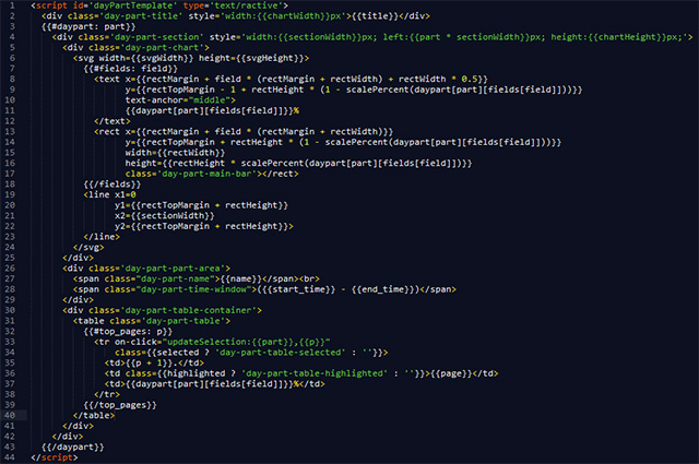
Javascript: create a chart including all the segments
          var n = json.length,
              fields = ['visitors', 'unique_visitors', 'clicks'],
              fieldsNbr = fields.length,
              ractive = new Ractive({
                el: container_id,
                template: ractiveTemplateId,
                data: {
                          daypart: json,
                          title: title,
                          fields: fields,
                          tableField: 0,
                          rectWidth: chartWidth / n * 0.75 / fieldsNbr - 5,
                          svgHeight: chartAreaHeight,
                          svgWidth: chartWidth / n,
                          chartWidth: chartWidth,
                          chartHeight: chartHeight,
                          rectHeight: rectHeight,
                          sectionWidth: chartWidth / n,
                          rectMargin: (sectionWidth - rectWidth * fieldsNbr) / (1 + fieldsNbr),
                          rectTopMargin: DEFAULT_BAR_MARGIN,
                          scalePercent: function scalePercent(p) {
                              return p / 100;
                          }
                      }
              });
          return ractive;
Javascript: the update function
                function updateChart(newData) {
                    var n = json.length,
                        svgWidth = ractive.get('chartWidth') / n,
                        sectionWidth = svgWidth;
                    ractive.animate('svgWidth', svgWidth);
                    ractive.animate('sectionWidth', sectionWidth);
                    ractive.animate('daypart', newData);
                }
And yes, that's it, as simple as that.
Putting it all together
You can find a complete example here on github
I added also a bit of event handling and extra properties to make things more interesting, but, besides some structural sugar,
it doesn't take more than it is shown above.
One thing worth noticing is that the amount of logic that "contaminates" the presentation can be controlled by the developer.
For example, instead of
<text x={{rectMargin + field * (rectMargin + rectWidth) + rectWidth * 0.5}} >
you could use
<text x={{textX(field)}} >
provided you add the textX method to ractive (as done for scalePercent above)
This way, only the binding stays in the HTML, and all the logic is back into JavaScript files. Alternatively, you could go the other way, and put more logic inline.